Quick Update: I’ve been working hard on my procreate series. I want to make it informative and easy to read. Procreate can be complicated enough, my goal is to make it feel approachable for those that don’t want to get into all the technical stuff.
I thought I’d talk a little bit about the challenges of working loosely. I have a number of students who take my classes who say it is very difficult for them to let go of the urge to put in all the details. I frequently tell them painting loosely does not mean a lack of detail, you can always tighten up a loose painting, but not the other way around. Think of it as baking a cake–you don’t put the icing on first, right? Because there is nothing to put the icing on–you haven’t made the cake yet so you can’t. It’s the same thing with drawing and painting–you have to define the form and structure of the piece before you put in the details.

It’s important to work the entire composition at the same rate of completion–in other words, I didn’t spend all my time on one figure until it was done while other parts of the painting were still just blank canvas. Cover up that empty canvas or paper, get the basic forms in and work the details on each form to the same level of completion before going back to the one you started with.
Working in this manner ensures that your painting stays cohesive and that no single areas stand out as more complete than the rest of the painting–you don’t want any parts to look “pasted on” and they will if they are more developed than the rest of the piece.
Getting back to the question, why loose? Perhaps I should have phrased it “why start out loose?”
Now it’s up to you, to decide when you are done. If you have kept your painting loose and now wish to make it tighter, there is nothing to stop you from putting in as much detail as you want to–you now have a solid structure to build upon. Or, if you are more inclined to keep your painting a bit on the expressive or impressionistic side, then you just stop sooner and leave the painting with details that are suggested rather than tightly rendered.
The point is, you can tighten your work up as much as you want to and it will look cohesive and effortless even with a lot of detail, as long as you build up to it and don’t try to put the detail in before you have the structure
How do you keep it loose while painting? Let me know in the comments below

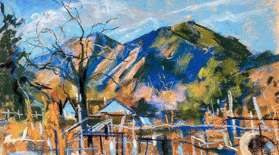
Come practice with me during my one day workshop, Ireland in Pastel. We will create a semi-abstract landscape of the Irish countryside. The emphasis will be on working with greens, getting a variety of hues, keeping the landscape abstract and geometric, and getting a sense of vast depth and space.
Follow me on insta @kullaf for more updates!